Making a demo for NES — HEOHdemo
There is a lengthy history of computer arts festivals, also known as demo parties, held in Russia over the last quarter century. For decades, once in a while people from all over the country gather together to compete in their ingenuity at getting what was once deemed impossible out of the old or new computer hardware and mere bytes of code. A few leading annual events has been established in the early years. One of them, creatively named CAFe (an acronym for Computer Art FEstival), was held in Kazan from 1999 to 2003. It went under the radar since, making the way for the everlasting Chaos Constructions (1999 — now) and DiHalt (2005 — now). After so long hiatus, the last year CAFe made a loud comeback, returning in full glory — at least by the number of prods released, if not in the scale of the event itself. Presentation of the compo entries went far into the night, with the last demos being shown at 6 AM to the popping eyes of the few hardy ones. There was my demo, too, and this is the story of its making.
I’m more on the fence rather than a major demo scene activist. My main interests are retro game and sound software development, which is somewhat related topic. Previously I only made a dozen of small intros for various hardware, and a reasonably ambitious demo for the red phone. CAFe organizers did a very good job promoting the event, directly inviting potential contestants both via messages and in person. Their efforts motivated me to go full on with creating my first true full-blown demo. Once again I picked a relatively obscure platform, this time it has been the NES/Famicom, known in the land of vodka and ushanka as Dendy — the most popular 8-bit video game console ever, that is, unlike its portable relative, somehow didn’t happen to have much love on the demoscene (yet).
Planning
At first I was going to tackle a long conceived idea for another popular 8-bit platform. However, it required a lot of research to be done first, and I wasn’t certain on whether it could work at all, is it going to be any good, and how long it would take to create. Thus the things were moving very slowly. Party day was approaching, and it became clear that if I’m going to keep my promise to the organizers, I should pick some another, more realistic project. After a brief evaluation of a second idea for the Wild compo that would take a good deal of research too, I opted to roll with an older idea of a NES demo that had some code sketched out three years prior, with intent to enter a Multimatograf compo.
The sketches didn’t made it into the actual demo, but having some backlog helped to decide whether direction to take. The plan to go with the NES has been settled down in early October. Project directory has been created October 8, with some minor stuff done a bit earlier, so I had about three weeks before the CAFe day for the main chunk of work.
The main question was to figure out the running time and number of scenes needed to qualify for a full scale demo rather than an oversized intro. This was important as it would affect all further planning a lot. In order to do this, I browsed all top entries for the NES on Pouet, and picked two all-time community favorites, High Hopes and NESPECCY, for more detailed analysis. The latter turned out to be an invitation to the very same CAFe party, that came out in December 2019, and somehow didn’t catch my eye. Being pretty good, it was a bit of let down to me, as I imagined my demo to be a much simpler than that initially. So I had to raise the bar in order to keep the competitive factor in.
The analysis provides following stats: High Hopes had about six scenes with total running time of 2:45, NESPECCY featured about 11 scenes in 3:45 minutes. This made an average of 25 seconds per scene. I estimated that 10–15 scenes should be enough. The plan was to make about 3–5 technically advanced effects, while the rest would be simple but attractive filler effects. To avoid simpler scenes to feel dragged out, and have a good pacing overall, I averaged it to 15 seconds per effect, with total duration of two to three minutes.
Then I estimated how much time I could spend on each scene considering the time limits. It was 1–1.5 days in the best case, not accounting the time needed to handle many other necessary things, such as music composing, graphics drawing, preparing development environment, and coming up with some general concept, after all. This estimate did not feel much realistic, so I decided to just do as many scenes as the time allow, and try to keep it up to two days per scene.
This way the primary goal has been defined: do at least something release worthy in available time. The development mode was set to «no time to remorse». This opted out a possibility of writing a development diary alongside the actual process, as it would be too much of distraction. So now I have to restore the events by memory, trying to avoid distorting the truth too much.
Due to the circumstances, I wasn’t going for making a compo winner. The important thing is not to win but to take part, and the main thing is victory over oneself, as they say. I didn’t have much expectations on the results, considering low popularity of the console demo category in our whereabouts. The worst case expected was to just make a compo filler, which is fine, as having fillers is important to make compos more interesting, or happen at all. The best case would be becoming a winner over myself with the only entry in the compo, which did happen to me before (with minor stuff like music and graphics), and it is fine as well. So it would be a win-win either way. Of course I would like to win a real contest with worthy opponents, but in fact I wasn’t fond of my entry much up to the release, and the audience appreciated it much better than I expected.
Programming
Once the time constrains and schedule has been understood, it became clear that I should keep my perfectionism under control and do not attempt to go for technologically sophisticated effects or perfectly optimized code. I had to find a compromise and use the simplest possible code that would take reasonable time to do, while providing visuals that would be interesting enough.
I decided to use a quite capable configuration, MMC3 board with 256K of PRG (code) and 256K CHR (graphics) ROM, and try to not worry much about not using up all of its potential. Widely used in commercial games since Super Mario Bros. 3 (1988), it isn’t the most powerful configuration possible. Still, all previous NES demo developments were limited to simpler mappers and lesser amounts of memory. In the end, my demo used up 80% of PRG and about two thirds of CHR memory. The excess memory allowed me to save development time by not implementing general data compression, although some compression has been employed at certain places.
Development tools and pipeline was an obvious choice: C compiler with some 6502 assembly code. C would be used for main chunk of the code, while assembly pieces would be used in case of necessity, such as memory-to-memory transfer routines, interrupt handlers, and music player. I’m using this approach in most of my 8/16 bit development for a while, to great success, as it helps to simplify development process and reduce time costs. Basically it enables an in-place high level language prototyping. In other words, I can sketch up something in C first, see how it works in the actual context of a NES program, and if the result is sub-optimal, I can just rewrite it into 6502 assembly by hand to achieve required execution speed, using C prototype as a template. Or just leave it as is in case it works well enough.

One potential issue I anticipated, yet it didn’t happen to be much of a trouble, was the RAM limitations. A vanilla NES has just 2K (2048 bytes) of RAM, and even though expanded RAM is supported by the chosen mapper, I decided to not use it. Considering the all around 8-bit design of the 6502 CPU, its memory map is often seen as a set of 256-byte pages. Here is the RAM layout I figured out for my project:
- 0000–00FF — so called zero page, containing quickly accessed variables;
- 0100–01FF — hardware stack and palette (as most of this page normally remains unused);
- 0200–02FF — OAM buffer, the sprite list that has to be in the main RAM due to the PPU design;
- 0300–03FF — VRAM update list;
- 0400–04FF — raster effects data, kind of a display list.
The latter two areas are defined in the main C code as regular 256-byte unsigned char arrays, and get reused for other purposes on occasion. The remaining three RAM pages are left for the C software stack, i.e. for global and local variables of the C code.
Dynamic RAM allocation (like malloc/free or new/delete) is not a thing on platforms like NES due to the memory size and speed constrains. So I had to stick to the static allocation that is commonly used there. As the demo code is a large program with tons of variables and arrays that would not fit the available 512 bytes, I had to come up with a way to (re-) use available memory efficiently. At first I tried to use as much local variables as possible, which allowed to reuse software stack space. The drawback of local variables is that they’re considerably slower than global/static ones. I soon ran out of free RAM for global variables, and reusing the same variables wasn’t much comfortable to deal with. So I went with another solution that was on my mind for a while, but I had no opportunity to test it out before: define a few overlapping RAM sections in the linker, located in the same physical addresses. This allowed to reuse the same RAM for scene-specific sets of variables and arrays by putting them into these RAM sections using C compiler’s pragmas.
Another problem with the NES is that it can’t address more than 32K of ROM directly, and has to employ bank switching techniques to access larger amounts of memory. It wasn’t much pf an issue, as I already had a reliable solution tested on my previous projects. MMC3 provides a switchable 16K PRG ROM page, so all code that is intended to put into extra pages was divided into functionally complete chunks that shouldn’t exceed 16K. The code is spread across pages using C compiler’s pragmas. Then they’re used in an overlay fashion: a page with scene code gets switched in, the paged code does its job, then control returns to the main code to call another paged part. Cross-page code calls are not possible in this scheme, but there is some code that has to be shared all across the program, such as music player, sprite display, and interrupt handlers. It is put into another 16K of PRG ROM that is always present in the CPU address space, so called fixed bank.
While working on the last scene I ran into an unexpected, kinda curious error message: local label overflow. As I figured out, the compiler has a limit on the number of generated local labels (presumably 65536) inside a single compilation unit. I used a single unit in my code to simplify the handling of extra ROM and segmented RAM. It was possible to overcome the issue by splitting the project into a few units, and I was about to do this, but the error is suddenly gone once I moved a const array definition from C code into assembler (incbin with exported label). It never came back even though I added a good hundred lines of code afterwards.
Development
To get a nice looking production done in given time, the plan was to pick technically simple effects, but always keep it smooth and running at full 60 FPS. So the usual demo stuff such as plasma and zoom rotators had to be omitted, not fitting much to the NES PPU architecture with its indirect VRAM access — it just would look noticeably inferior to other 8-bit platforms where this type of effects had been polished and shining for years.
At first I was going to go along with the three year old plan. All effects would be made using the same rendering engine that modifies display parameters, such as vertical and horizontal offset, or graphics set, for every raster line. This would save development time by re-using the same code for most of the demo. However, the result would likely be a bit boring, full of similar effects. This kind of effects is also most typical for NES-like hardware and has been done in many other demos. I also ran into issues with debugging this code, so the only effect of this type that ended up in the final product, was the rotating NES cartridge.
Active development started from a couple of old code sketches. One of those later made it into the Kirby scene, and the other one was scrapped. At the same time I began to write down all ideas on the effects and demo concept in general into a text file. In the end there was more than 40 effect ideas, about 15 of which has been implemented. Most of the effects are some sort of animation, although its implementation is unique enough for each scene, and employs various tricks to make it smooth and clean at reasonable memory expenses. Somehow it turned out that most of the scenes feature some kind of a rotating object. I guess that’s a good thing, as it brought some uniformity at the conceptual level.
I came up with the intro gag scene and implemented it. Then I did the color bars and TV noise. At this point I picked up a working title HEOHdemo for this project, based on the gag from the intro (AON — HE OH, which means «not him» in Russian). As the time has come to implement the title scene, I decided to just go with the working title, having no better ideas at hand and no time to make them up.
The character from intro and decision on the demo title helped to settle down the general concept, which came along 10 days before the deadline. The idea was to use some memorabilia from video game and pop culture, such as mascots, logos, and game elements, that would’ve been altered to look like a fake version of themselves («not them»). I also decided to spread comical approach from the first and last scenes to the rest of the demo, in order to compensate not so advanced tech. This is kind of along the spirit of the time and place of imagery used (mid 90s in Russia), when computer related stuff was driven by amateurs and had a good deal of geek humor involved. This approach also appealed to a wider audience, considering that game consoles has their own large following which does not overlap with demoscene much. Retro gaming fellows may be not very educated in the technical craftsmanship, but humor is universal media. The time period also suggested the structural approach of separate, not much interconnected scenes, that has been typical for demos in early 90s. This simplified development process, and later turned out to be very handy time saver in making the music and syncing parts.
The VID scene, rotating N logo, and Mario scenes came along spontaneously while doing the other more planned out work. They were made just as an idea come up, kind of a procrastination from the more difficult parts that weren’t going that well.
Finishing
It was clear from the beginning that the intro, title, greets, and end roll going to be the longest parts, filling major part of the running time, so development efforts were mostly focused on these scenes at first. At some point it turned out that demo already has a complete beginning and end (not changed much in the final version), yet it completely misses out the middle section that only had one scene done. The deadline was approaching fast, and the project turned into an exhausting development marathon that consumed all possible free (and not really free) time. Remainder of the planned scenes list has been sorted by difficulty to pick ones what would take least amount of time to implement. All of the picked ideas then has been simplified and cut down to the bare minimum. I did the Vaders scene, figured out the rotating cartridge issues, finished out the long dragging tower scene that went under many visual changes. As the scenes were getting finished, I was finding them a suitable place in the final script.
Every little thing was taking triple of the estimated time, so a few days before the deadline the demo was still missing a good half of scenes, and barely had any music. I got the feeling that I’m not going to make it on time, and started to have pessimistic thoughts about a possible Plan B, like skipping CAFe, finishing the demo whenever it is done, and get it released on another occasion. Luckily, a better crisis management has been figured out: first focus on just combining everything I already have into something that would resemble a complete releasable product, even though a really sketchy one, then get at least some sort of the music done to cover up the whole duration, and in case there is any time left after this, attempt to add more effects. Among the scenes added in the last moment were Pacman intermission and Mario, both a lot simplified compared to the initial ideas.
This approach saved the day, although it led to a major incoherence in the middle of the demo, as well as hard cuts in music between many parts. Still, it helped to get a finished product of reasonable quality done a day before the deadline. I spent the extra time polishing some details out, as well as improving the music. During this time Vaders and Toad got their final altered look done, too.
Debugging
I don’t own a Flash cartridge or a NES console, so I couldn’t test my code on the real hardware, and had to rely on emulation only. FCEUX has been used as a main test platform. It isn’t the most precise emulator around, but it has a nice debugger, and a very short start up time, which is imporant when work is done in the «added a couple on lines, did a test run» fashion. More demanding effects were tested with more precise yet a bit less convenient Mesen, punes and Nestopia emulators.
As the whole demoscene essence is pushing hardware to the limits to pull up something that never been done before, it was a good challenge for emulators precision. It exposed various emulation issues, as well as incoherence in some edge cases. An effect may perfectly work in one emulator, while having major artifacting in others. Considering this and with some quirks of the NES architecture, I had to debug and tune up time critical effects multiple times, using different emulators. For the release, I tweaked up the whole thing to work flawlessly in the most popular FCEUX that has been bundled together with the ROM when I sent it to the competition, and to work cleanly enough in all other emulators.
One interesting issue has been found in the debugging process. The rotating logo scene had a visual artifact that was only appearing in Mesen. In this scene PPU render gets turned off just below the «inspired by» text in order to free some raster time to perform a large VRAM transfer (which is only possible while rendering is turned off). Render then wouldn’t get re-enabled until beginning of the next frame. It worked just fine in all emulators but Mesen, where it somehow caused a major corruption in sprite display. Turning rendering back on near end of the frame fixed this issue. Post-release tests revealed that there is indeed some sprite related issues on the real hardware if rendering is not re-enabled, although their appearance may vary.
Demo is designed to run on the NTSC consoles only, because adding PAL support would double the debug time — some effects are based on very precise timings that would need to be tuned up separately for each of the systems. To keep running time the same it would also require to have two versions of the music, doubling amount of its data. Thus I opted to properly support only one, most popular system. Demo does auto detection on start up, and displays a warning message in case it runs on a PAL system. It will work for the most part, though, just with some visual artifacts, and run 17% slower.
After the demo has been released to the public, some people tried to run demo on various kinds of real hardware, including NES, Famicom AV, even a Pegasus (a twin brother of Russian Dendy Classic 2 that was equally popular in Poland and Chezh). It turned out that it works on either of these well enough, but has visual artifacts in some scenes. It was expected that there may be some issues on the real thing, however the unexpected part was they’ll be different between all of test configurations. Some of the issues could’ve been caused by imperfections in MMC3 implementation of popular Flash cartridges, while others are certainly my mistakes. The least amount of issues was found when running the demo on a board with original Nintendo MMC3 chip. Next least troublesome configuration turned out to be Pegasus, even though demo wasn’t expected to work there ar all. It only had a small issue in the Mario scene. To my surprise, the most timing sensitive and tricky to debug scene, rotating cartridge, worked just fine on either of the test configurations.
The issues weren’t critical, and after some back and forth tests performed by mr287 and dude_bfg, as well as using input from video captures by Morden and Bugrim, everything has been sorted out, with a final edition released afterwards.
Composing
I stated to work on the music from picking up «New Reality» TV show theme from 90s (it was all about Dendy and other consoles), and attempted to mix it up with «Slavsya», which has been used as the iconic AON start up sound. Somehow it took an awful long, even longer than all the following composing work. AONDEMO also hinted the idea to use short beeps as percussion in the first few bars. I composed a short piece with this percussion to play along the title sequence. Then I came up with idea to reuse the same part, albeit arranged differently, in the greets scene, to serve as kind of recurring theme. The work then stopped for a while, and all remaining music composing and syncing it to the action has been done in just two days before deadline.
Despite relatively poor sound capabilities of the NES, there is a few recognizable music arrangement styles on the platform, up to the point that one could guess the developer by the way it sounds — Konami, Capcom, Sunsoft, Natsume, general European type, and other kinds. After some experiments, I decided to use a mixed style, without arpeggios, which is more along lines of Japanese productions, but with powerful synthetic drums of the European tradition. The latter allowed to avoid using DPCM channel for drums, and it was important, as its use would mess up with many time critical pieces of code, complicating debug a lot.
I did some initial composing work using Reaper and a MIDI keyboard. The actual music was created using FamiTracker, a common modern day approach to the NES music. I also use MIDI keyboard for improvisation over backing track playing from FamiTracker to come up with some of the melodies.
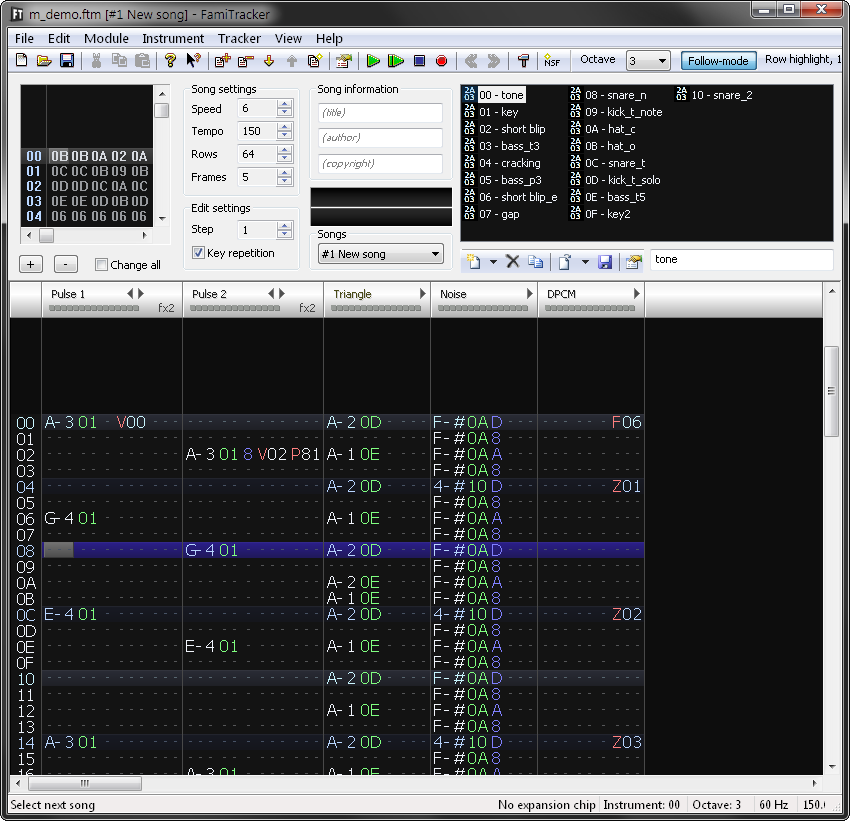
Although FamiTracker comes along with a 6502 player code, it is quite CPU and RAM demanding, taking up to 1/5 of the raster time. Alternative players, such as my own FamiTone, put a lot of trade-offs in order to gain more speed. So I decided to create a new custom player that would not limit capabilities in any way, and save CPU time by using significant amounts of ROM space instead. The player used a direct APU register writes dump, a common demoscene practice found on many 8-bit home computers. Having lots of PRG ROM at hand allowed to not use any sort of compression. I made a custom tool that would take a NSF file exported from FamiTracker, playing it via means of emulation, and dump the resulting data into a file. In other words, all music player logic was moved to the compile time, leaving the NES the least possible amount of work — just a dozen of register writes per frame.
To achieve tighter sync between the music and visuals, I implemented a sync marker system that injects special events into the data stream. It has been used for the flashes during title and greets sequences. Markers set directly in FamiTracker's note text using Zxx command that is normally used to send an immediate value to the DAC, the functionality that is not used in the demo.
The effects
Text at the beginning
This line of a text is implying that following effects aren’t true ones, it is a nod to the long going demo scene community debate on the role and acceptability of animation in demoscene productions. As most of demo effects tend to use pre-calculation that can be considered a kind of animation to some degree, the borderline is vague.
Code for this scene is lifted up from an old project of mine. The fading in part of the line is displayed with sprites that has different palettes assigned. Once the characters reach full brightness, they’re get imprinted into the background layer. The process then repeated in reverse to hide the line.
The intro
This is a gag based on my previous demo for the red phone, in the rickroll fashion. An initial idea of short intermission that would start right from the scrolling text developed into a scene that featured the first character in the demo, Dendy the elephant that is official mascot of Dendy consoles.
There is nothing special tech wise, the main challenge was to convert colorful image made with Graphics Gale into a multi-layered sprite (think Megaman’s face) that would overcome the HW sprite limitation of 3 colors per sprite. There is four sprite layers with unique palette for each one, featuring 10 colors total. The picture has been manually split into layers, each layer separately converted into NES graphics format using NES Screen Tool, then layers were combined using its built-in metasprite editor.

TV noise
A had this simple effect in mind early on, but didn’t know where to put it. Once the following color bars effect had been envisioned, the obvious decision to put the noise into the intro sequence has been made. The code was done among the first effects, and served as a base for following, more complex effects.
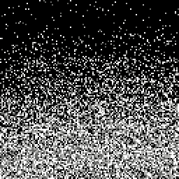
Despite very simple look, displaying random noise is not something that NES video hardware is well capable of. In order to achieve the effect, there is 8 sets by 32 tiles each that contain noise texture of varying density. This graphics set has been generated with a simple custom tool on PC. To display moving noise, all sets placed to the first 8 rows of the nametable. A MMC3 interrupt is firing each 7 raster lines (the 8th one is lost to setting up the following row interrupt), and each tile row gets its own unique background layer random offset, done via rewrite of the PPU display counter. This allowed to achieve a more realistic noise animation.
Color bars
The first true, relatively tricky to design effect that has been made for this demo. It consist of two separate seamlessly connected parts, one is the timer (that shows actual demo running time, by the way), and another is the zooming color bars.
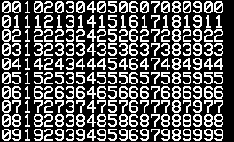
Although the timer may look like nothing special, it actually doing something unusual for the NES. The characters there are 12×16 pixels large, while background layer can display images constructed from 256 tiles placed on an uniform 8×8 grid only. Hardware sprites, while not having to stick to the grid, can’t cover up area wider than ¼ of the screen. To overcome these limitations, I generated an image of all possible number pairs from 00 to 99, a pair is three tiles wide, so it fits the tile grid requirement. Duplicating pieces of the graphics were removed during conversion, which boiled down the tile count to some 150, and produced a tilemap to reconstruct these pairs in the nametable. The timer falls down with simple vertical scroll. As you can’t notice scroll on the solid colored straight vertical bars, it makes a brief illusion that only timer is moving over the static background.
Once timer leaves the screen, a MMC3 interrupt handler gets enabled. It is the same exact code as with the TV noise effect, but this time around it simply duplicates top row of the nametable into all rows across the screen.
The zooming effect is a simple nametable animation. It is done for the single top row only, so it only requires to update 32 bytes of the VRAM per frame, while interrupt handler stretches the effect to the whole screen. There is 238 frames of animation, which takes up 7K of ROM. The frames share the same static tileset that contains all possible 53 transitional tiles. The tiles were drawn by hand, while zooming animation was generated by a custom PC tool that would render bars in all required scales and pick suitable tiles out of the pre-made set, also generating tile map of the animation.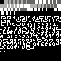
Title sequence
At first I had two alternative, more sophisticated ideas with the same large rectangular characters for this scene, but I decided to go with a third option that was just easier to implement.
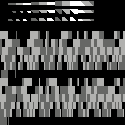
The characters were made rectangular to simplify rotation animation. Each character is basically 5×4 huge pixels large, with just 5 possible pixel combinations in each horizontal strip. I used Blender to create a rotation animation from edge to face for each of the possible strips. The pre-rendered frames were combined into a single large image, color depth has been reduced to 3 colors, then it was imported into NES Screen Tool — this reduced all the graphics into mere 82 tiles and a tilemap that is used for animation. In fact there is two animation sets like this in the demo, one of them is horizontally mirrored to allow characters to rotate either way.
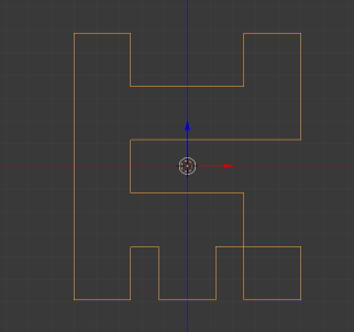
Rotating character animation is rendered into the nametable, strips selected depending on the character and its angle. As there is only one rotation at a given moment, I could change the edge color in order to make illusion that the characters are differently colored. The character edges that is flying inside the screen is displayed using sprites, and get replaced with the background layer animation at the exact moment a character arrives to its place. The placement and velocity of the sprites were fine tuned by hand to get smoothest possible movements and seamless transitions.
The colored horizontal strips scrolling in the background were made using a MMC3 interrupt, in this case it sets up horizontal pixel offset for each row of the nametable.
Space Vaders
I had idea of this very simple scene that would feature large rotating pixels forming up some pictures early in the development, and prepared a few pixel rotation animations using Gale. The scene itself was implemented much later, once the general concept was settled down, and I decided to go with the iconic characters.
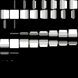
Rotating pixels gets animated via sparse background layer updates, while stars on the background is rendered using sprites.
The slow pacing of this scene is explained by its bare sync to the music, there is one change per music bar. As I didn’t invest enough time into pacing all the scenes properly, it seemed fine at first, and I never came back to revise it later.
Spinning logo
Due to the lack of middle section effects and the time constrains, I needed a filler effect done quick, so I decided to re-purpose a small NES intro that I made a couple years back. It featured the same layout with a static logo in the middle with orbiting letters around. Recently I got interested in N64 platform that I somehow missed out back in 90s, and having this at back of my mind, I came up with the idea of replicating the iconic 3D logo, which seemed pretty easy to do. It turned to be not that easy, though.
The logo is just a pre-rendered animation, no real 3D polygons here, yet it still something you won’t see on the NES quite often. The main challenge here was to fit such a large and smooth animation into reasonable amount of ROM. An uncompressed frame animation would take 4K — a full tileset. Actually it takes less thatn 256 tiles, but more than a half, so two frames couldn’t fit the same set, and there would be some padding space wasted. The whole 256 frames would then take 1024K of CHR ROM, with the whole MMC3 configuration capacity the demo was using being just 256K. Three tricks has been employed to fit the same animation into 1/16 of the space and still get the desired result: only ¼ of the rotation cycle is used (64 frames), with edge colors swapped before repeating the cycle; lossy graphics conversion that allowed to squeeze groups of 4 frames into one tileset; and VRAM transfer performed in the visible raster to achieve required update speed.
The logo animation has been created using Blender. While working on it I decided to alter it according to the demo concept, by simply mirroring it, so N would became the cyrillic И, and it looked kinda funny. Pre-rendered frames were combined into groups of four, color depth reduced to 4, then resulting images were imported into NES Screen Tool using the lossy import. This feature is my secret weapon — it helps to drastically reduce number of tiles while keeping image recognizable by finding and omitting the most similarly shaped ones until the desired tile count reached. Of course, such reduction produces visible distortions, and often requires a manual touch up, but it is very handy at fitting complex images into lower tile limits with lesser effort.
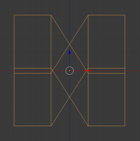
To animate the logo, a 14×14 tile area of the background layer gets updated every frame, and tilesets get switched as needed. There is MMC3 interrupt that is firing just above the text string. It first switches in the font tileset, waits a few lines, then disables rendering, so the white color remains to be displayed during rest of the screen, while enabling VRAM access to perform a large transfer.
The coins are displayed using HW sprites, their trajectory is calculated in real time using a few LUTs and fixed point math. The old code was modified to avoid intersections with the larger logo, and to make coins seamlessly appear and disappear in desired moments. They’re getting behind the logo graphics just by using the per-sprite display priority flag, a NES PPU feature, that gets enabled depending on sprite location.
Rotating cartridge
Implementation of this effect is pretty simple on paper, but it took a while to make it work properly. There is a MMC3 interrupt handler that starts the effect on a given raster line, and it lasts near the end of a frame, to leave some CPU time to the main thread. Inside the effect body there is precisely timed out code that sets pixel perfect vertical offset to the background layer for each screen line. This requires very tricky sequence of PPU register writes that has to be done at very specific places. NTSC version of the NES has an uneven relation between CPU and PPU clock frequencies, and there are other factors contributing to the sync between two processes. So the sync goes off and needs to consider all contributing factors in order to keep the picture stable.
Most of the graphics has been pixeled out a few years back, on my first attempt at making a NES. Now it was updated with the cartridge top and bottom edges, as well as the back side and the demo logo. To make things easier to code, I squeezed all the four sides into a 240 pixel tall picture. As all sides obviously wouldn’t fit into this height, the effect does a vertical stretch on some parts of the back side graphics during rendering.
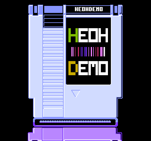
The rotation is a pre-calculated animation that is created with a custom PC tool. It takes an awful lot of ROM space, three 16K banks. Each animation frame has 176 numbers of the source picture lines mapped to the screen lines. It sure was possible to do these calculations in real time, I did it before for another project, but in this case I had enough of ROM space and very limited time, so it was a compromise to cut the corners.
Pacman
This part was first planned as a regularly sized, more interesting scene, but due to the time limit it has been cut down to just a brief intermission between other scenes, serving as a break between two music pieces.
The main problem here was to decide on the number of frames, which would depend on the scene pacing, and figure out a quick way to produce the required animation. Expecting that there is going to be many frames, I thought to use Blender again at first, but after some experiments and pacing estimates realized that this animation only needs 8 very simple frames of the transition from closed to open mouth, and it going to be much easier and faster just draw it by hand with Gale, which I did.
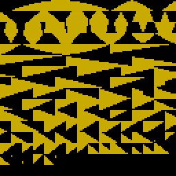
One I got the frames, yet another custom tool has been made. It finds all tiles that get changed between two adjacent frames, and stores the difference as position and tile number lists to perform scattered VRAM updates. Graphics of all 8 frames fits into a single tileset and remains unchanged during animation.
Kirby
While making this scene I was using my old NES picture, Catrix, as a placeholder. There was an idea to do some picture transformation effect in the middle, like from the regular cat to some alternate Cheshire cat picture. Once the plan to use iconic characters has been decided, I get into urgent need of making two full screen pictures that would be suitable to the topic and happen to fit 256 tiles each. So a quick decision was made to draw Kirby and his alternate version. The transition effect get reduced to a mere flashing between the two pictures.
Moving blocks are displayed using sprites. Once they get in place, they’re getting imprinted into the nametable. Falling out effect works much the same, just in reverse.
Tower
I always loved rotating tower effect in video games, namely the final level of Battletoads, and I wanted to replicate it. Greets section seemed to be an appropriate place for it.
Technically it is very simple, just a regular vertically scrolling background. The rotation illusion is created through animated tile graphics, the map itself always remain the same. Animation uses a MMC3 CHR mapping mode that allows to bank switch four 1K sub pages of the tileset separately. First page is used for the static graphics, three other are used to switch in a frame of tile animation. Having three independently animated sets allows to have different rotation speed. One of the pages also smoothly changes animation direction. As animated tile strip only uses 28 tiles, and there is 64 tiles in 1K page, each page has a mirrored duplicate of the animation, this gives rotation in reverse in addition to the normal direction for free.
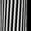
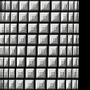
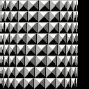
Yet again, the main challenge was to find a way to produce such animation, and it was again done with a custom PC tool. It took a 16×16 texture and a pixel curvature table on the input, and produced 16 animation frames as a full 4K tileset (some of tiles were empty). The sets were then converted with NES Screen Tool into CHR files, and allocated in the CHR ROM with a specific interleaving using offset feature of the assembler’s incbin directive.
Another important thing for the greets section was to greet everyone I would like to. As the number is next to infinite, and the scene can’t last that long, I had to put an arbitrary criteria on the name picking, and decided to greet those whom I was interacting to in the recent year. During the whole time I was working on the demo, I was running a text file, writing down the names as they popped in my mind. Of course once the demo was completed and went to the public, a lot more has been remembered. Sorry, guys, will fix it next time.
Corridor
I wanted to have a scene with some 3D perspective, such as a classic demo tunnel. However, a true tonnel, or some Wolfenstein 3D-like raycaster perhaps, are quite difficult to do on the NES hardware, and would take a while to make. Also, there were some attempts to implement a Wolf-like engine on the platform already, some featuring textures even, and while they were quite impressive, they’re universally suffered from very low frame rates, while I wanted all effects to be very smooth.
I love the old step based corridor rendering techniques found in many early pseudo 3D games, such as 3D Monster Maze. I did have some prior work done on an engine with smooth turns sketched out, inspired by Zig Zag for ZX Spectrum, so I decided to use what I have. As an abstract empty corridor wouldn’t be that much fun, I came up with a silly idea about Mario seeking a private place in hurry, which brought at least some plot to the otherwise pointless scene, and it served well for the demo conclusion. This was the last scene done for the demo, too, and despite having some old material, the actual implementation took 11 hours straight.
All corridor movements were drawn by hand using Gale. This is the only scene in the demo that runs below 60 FPS. It can totally work at this speed, but I had to reduce it to 30 FPS in order to make is easier to follow, and better sync up to the music. This was a compromise over adding twice more intermediate frames to smooth out the animation, which was not possible due to lack of time.
There is two tile sets. For each on-screen frame the nametable gets updated, one of tile sets gets enabled, and four palette colors gets updated (two for the top half, two for the bottom). The color swap is needed at 90 degree turns, as colors of the wall get exchanged. Nametable data gets copied from a switchable PRG bank into the main RAM using a routine in the fixed PRG bank first, then RAM copy gets transferred into the VRAM similar to the rotating logo scene, in the visible part of the screen with PPU rendering being disabled. The latter also serves as clipping mask for the bottom of the Mario sprite.
Staff roll
This scene has been developed among the first, right after the color bars. I lifted up some code from an old project. It had the two font sizes, palettes support, and slowing down near end implemented already. I designed two new fonts that is also were used all around the demo, and added the screen edges dissolution effect.
At first I wanted to do a simple fade out on the edges on the screen using palette swapping, but tried to do some horizontal shifting while setting up the code, and the result looked pretty good, so I decided to go with it. There is a bit of darkening too, done via the ambiguous color emphasis feature of the NES PPU. The problem with this feature is that it does not work uniformly on all the NES models, with the issues ranging from simple color component switch between PAL and NTSC versions, to weird color tints on the clones, and to complete wrong colors on the so called RGB PPU. The way it used in this scene should work just fine on the regular models, and RGB PPU will get a huge white border around the scroll area.
VID
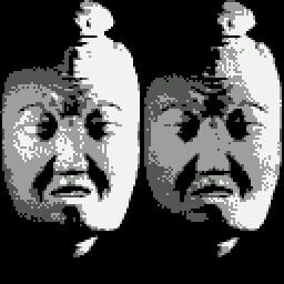
About the time I was working on the end roll, this idea came up. VID is a TV company from 90s, that had the iconic logo that left strong memories to many kids of the time, who had nightmares about it, so the face from the logo (which in fact belongs to a philosopher from Ancient China) is now remembered as some scary character called VID. At first I thought to put it as a jump scare somewhere in the middle of the demo, but eventually it found its place as a post credits scene. This little part actually contains three effects at once — sprite pseudo scaling, increased color depth, and a software decoded DPCM sample.
The pseudo scaling is based on the fact that all large sprites on the NES has to be composed out of smaller hardware sprites, 8×16 in this case. If the smaller parts gets displaced relatively to each other, a scaling or warping effect can be created, and while changes are modest, the illusion works pretty well. A straight forward approach would require an integer multiplication of each of the HW sprite offset from the pivot point by the scale, but humble 6502 at 1.79 MHz isn’t really up to the task. Rather than calculating offset for each sprite, a regular grid composed of two axes is calculated before displaying a sprite, drastically reducing number of multiplications performed. With sprite composed out of 64 (8 by 8) HW sprites only 16 (8+8) multiplications is needed compared to 128 (8×8*2) of the straightforward approach. The same scaling technique is also used for Mario and door sprites in the previous scene.
NES PPU is only capable to display four shades of gray, including black and white. VID scene makes an illusion of having seven grades by alternating two frames. The idea is simple: if there is a white pixel in each frame, it looks white, if there is a gray pixel in each frame, it looks gray, but if there is white pixel in one frame and gray in another, the result will look like a shade somewhat in between. The main challenge here was preparing the two halves of the picture, which required a number of manipulations done in Gale and GIMP. Pixel rows of the halves were then interleaved in order to reduce flickering.
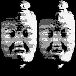
There was not enough room for the sound sample that would take a lot of space in regular PCM formats, so I opted to use DPCM, which is common format on the NES. It compresses the data 8:1 with equally huge loss in quality. However, NES hardware DPCM unit puts major limitation on location of the sample in memory, and I didn’t have nearly enough room in the allowed area. So I implemented a software decoder that didn’t have such specific requirements. The sound itself does not come from the TV company logo, this is the iconic fatality sound from Mortal Kombat 3 that was hugely popular in the same time period and that sounds quite similar. I thought it going to be a fun mix up that won’t get recognized by most viewers.
Memory layout
NES Space Checker was frequently used during development in order to control and plan ROM space use. This tool allows to display contents and usage of PRG and CHR banks, which provides a easy to grasp visual feedback, as well as an interesting insight on location of various parts of a program.
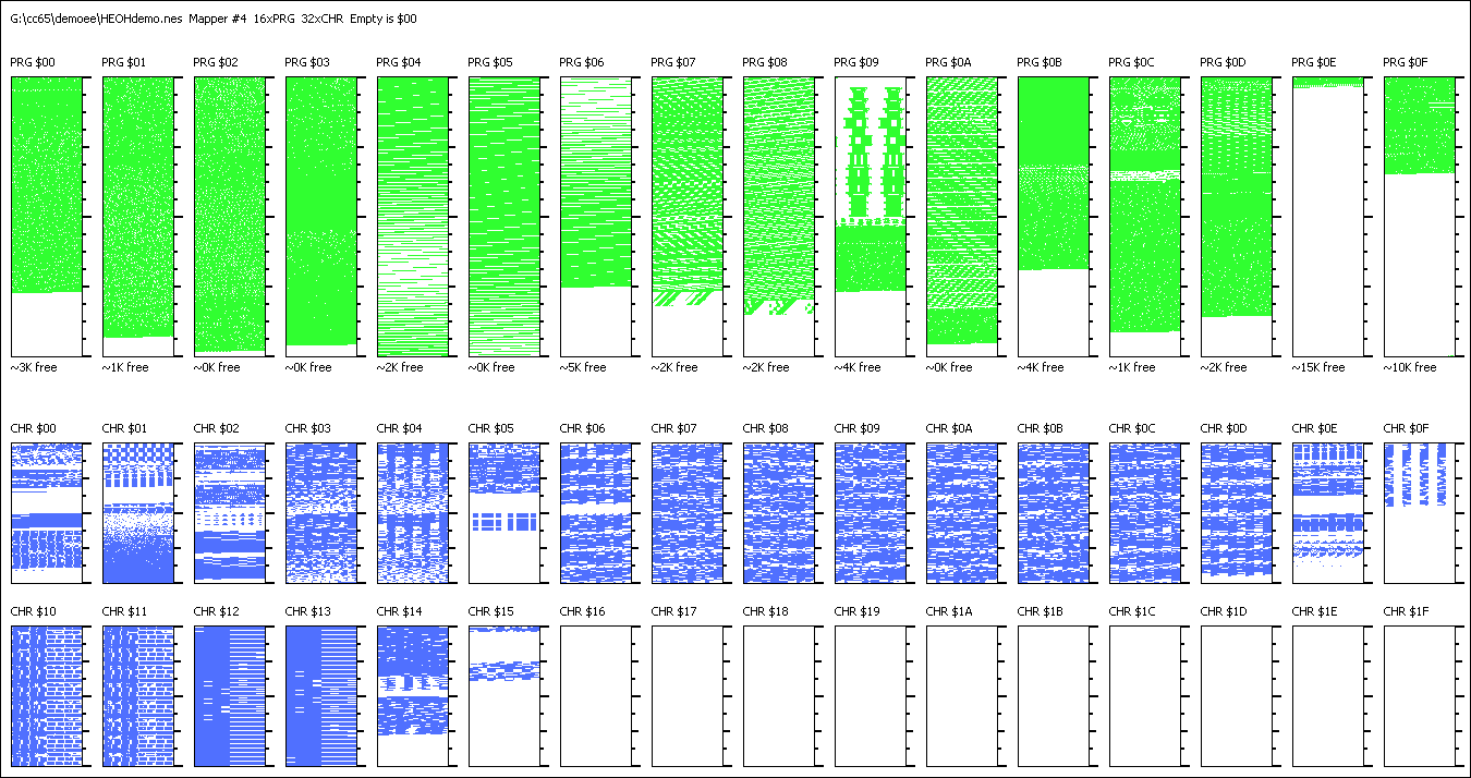
PRG00…PRG02 — music data
PRG03 — VID scene’s sound sample
PRG04…PRG06 — rotating cartridge animation data
PRG07 — tile animation of running into the corridor
PRG08 — tile animation of turning in the corridor
PRG09 — tower scene code
PRG0A — spinning logo scene code
PRG0B — title sequence and corridor scene code
PRG0C — rotating cartridge, Kirby, VID, Vaders, and Pacman scenes code
PRG0D — intro, TV noise, color bars, and staff roll scenes code
PRG0E — main code bank that only calls the other scenes
PRG0F — fixed bank, contains music player, sprite routines, and interrupt handlers
CHR00 — elephant and color bars tiles
CHR01 — font and noise
CHR02 — VID and title characters tiles
CHR03 — normal Kirby tiles
CHR04 — Cheshire Kirby tiles
CHR05 — rotating cartridge graphics
CHR06…CHR0D — spinning logo animation
CHR0E — greets font, Vaders scene tiles
CHR0F — Pacman tiles
CHR10…CHR13 — animated textures for tower
CHR14 — corridor tiles
CHR15 — Mario sprite
CHR16…CHR1F — unused
Links
Download HEOHDEMO — final version (complete with source code)
Download HEOHDEMO — party version
